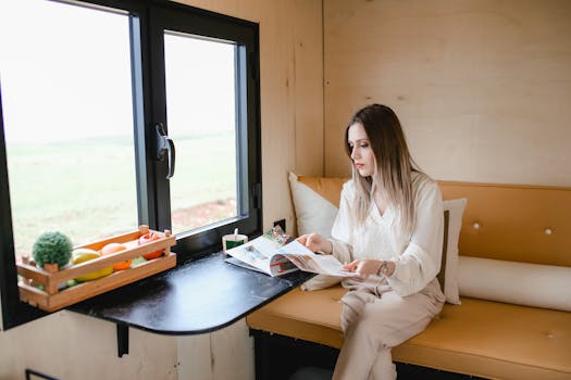
Ever walked into a room and just felt good? Or maybe the opposite – you felt a bit restless or even drained? Chances are, the colours in that space played a huge role. It’s easy to overlook, but the subtle, and sometimes not-so-subtle, way colours interact with our environment is incredibly powerful. This isn’t just about making your home look pretty; it’s about crafting an atmosphere, influencing your mood, and even impacting how you perceive your space. When we talk about home colour design, we’re really talking about creating a living, breathing extension of ourselves.
Think of it like this: paint isn’t just pigment; it’s a mood enhancer, a space expander, and a style statement all rolled into one. Getting it right can elevate your everyday living from mundane to magnificent. Let’s dive into why this seemingly simple aspect of interior design holds so much sway and how you can harness its potential.
Why Your Colour Choices Matter More Than You Think
It might seem straightforward – pick a colour you like, slap it on the walls, and you’re done, right? Not quite. Colours evoke specific psychological responses. For instance, blues and greens are often associated with calmness and tranquility, making them fantastic choices for bedrooms or spaces where you want to unwind.
Reds and oranges, on the other hand, can be stimulating and energetic, perfect for living areas or dining rooms where you want to foster conversation and liveliness. Then there are neutrals like greys, beiges, and whites, which offer a sense of sophistication and can serve as a beautiful backdrop, allowing other design elements to shine. The specific shade, its intensity, and how it’s paired with other colours all contribute to the overall feeling.
#### The Psychology Behind the Palette
Ever heard of colour psychology? It’s a real thing! Warm colours (reds, oranges, yellows) tend to make a space feel cozier and more intimate, drawing people together. They can increase heart rate and create a sense of excitement.
Cool colours (blues, greens, purples) typically have a calming effect, making spaces feel more serene and expansive. They can lower blood pressure and promote relaxation. It’s amazing how just a shift in hue can totally change your perception of a room’s size or temperature!
Beyond Aesthetics: Functionality and Flow in Home Colour Design
When planning your home colour design, it’s not just about what looks good on Pinterest. You need to consider how you use each space.
High-Traffic Areas: Think hallways and living rooms. You might opt for slightly more durable or forgiving colours that can hide minor scuffs.
Relaxation Zones: Bedrooms and studies benefit from colours that promote focus and calm. Soft blues, muted greens, or warm, earthy tones can work wonders.
Entertaining Spaces: Dining rooms and kitchens can handle bolder, more vibrant colours to encourage sociability and appetite.
It’s also about how colours flow from one room to another. A cohesive colour scheme throughout your home creates a sense of harmony and makes your entire house feel more connected. This doesn’t mean every room has to be the same colour, but rather that there’s a thoughtful transition between them.
#### Creating an Illusion of Space
Did you know colours can actually make a room feel bigger or smaller? Light, cool colours tend to recede, making walls appear further away and thus creating an illusion of more space. This is why white or pale blue is often recommended for small bathrooms or cramped apartments.
Conversely, dark or warm colours can make a large room feel more intimate and cozy. If you have a vast, echoey living room, a rich, deep wall colour can make it feel much more inviting and less overwhelming. It’s like visual trickery, but with paint!
Harmonizing Textures, Light, and Your Chosen Palette
Colours don’t exist in a vacuum. They interact with light, textures, and furnishings in your home. A colour that looks stunning on a paint swatch can appear completely different in your home once the natural and artificial light hits it.
Natural Light: Rooms with lots of natural light can handle deeper, richer colours without feeling too dark. Rooms with limited natural light might need lighter, brighter shades to avoid feeling gloomy.
Artificial Light: The type of light bulbs you use (warm white, cool white) will also affect how colours appear. Always test paint colours in the actual room under your typical lighting conditions.
Textures: The sheen of paint (matte, eggshell, satin, gloss) also plays a role. A matte finish absorbs light, creating a soft look, while a gloss finish reflects light, adding a subtle shimmer and making colours appear more vibrant. The texture of your furniture, rugs, and decor will also interact with your wall colours.
#### Finding Your Personal Colour Story
Ultimately, the most important factor in home colour design is your personal preference and how a colour makes you feel. While trends and design principles offer valuable guidance, your home should reflect your personality and lifestyle.
Don’t be afraid to experiment! Start with a single accent wall, a piece of furniture, or even just cushions and throws. See how you feel with these new additions. Sometimes, the smallest change can have the biggest impact on your overall enjoyment of your home.
Common Pitfalls to Sidestep in Your Home Colour Design Journey
While it’s exciting to reimagine your space, there are a few common missteps that can lead to less-than-ideal results. One frequent error is choosing a colour solely based on a tiny sample or how it looks in a catalogue. Colours can shift dramatically in different lighting and environments.
Another pitfall is going too trendy without considering longevity. A bold, in-vogue colour might be fun for a year or two, but you might tire of it quickly. Aim for a balance between personal style and timeless appeal, especially for larger surfaces like walls. Overlooking the flow between rooms is also a big one; a jarring shift from one colour to another can make a home feel disconnected and chaotic.
#### When to Seek Expert Advice
If you’re feeling overwhelmed, or if you have a particularly tricky space, don’t hesitate to consult a professional. An interior designer or colour consultant can offer invaluable insights, saving you time, money, and potential headaches. They have a trained eye for colour harmony, understand the nuances of light and space, and can help you achieve a cohesive and beautiful result that truly speaks to you. It’s an investment that can pay off in long-term satisfaction with your home’s aesthetic and feel.
Bringing It All Together: Crafting Your Colourful Sanctuary
So, there you have it. Home colour design is far more than just picking a shade of paint; it’s a powerful tool for shaping your environment and influencing your well-being. By understanding the psychology of colours, considering the functionality of each space, and harmonizing with light and texture, you can transform your house into a true sanctuary. It’s about creating spaces that not only look good but also feel good, supporting your lifestyle and reflecting your unique story.
What’s one colour you’ve been hesitant to use, but now feel inspired to explore in your home?